
I never start building before I have a plan.
That goes for my backend work — I don’t write API endpoints without a schema and an architecture diagram first. It goes for previous frontend work with HTML and Thymeleaf, where I always started in Figma before touching a template. And it goes for this, my first real React project.
But this week wasn’t about deciding which component to build first. It was about understanding what I was actually building: a user-facing system on top of a backend I’ve been developing for weeks.
The goal (why the React phase matters)#
After 11 weeks of backend development, this is the exciting part: making the data come alive.
Until now, MiseOS has mostly existed as domain rules, endpoints, and database state. The React frontend is where that turns into workflows people can actually use — forms, lists, approvals, and navigation that reflects real roles in a kitchen.
This phase is also the real test of the backend. As soon as I start wiring up UI and state, I’ll find out if the API design is consistent, predictable, and solid — or if there are edge cases and missing pieces I didn’t notice while working only on the server.
My personal goal is to learn as much React as possible by building a real application. The backend gives me the perfect playground for that: I can work with complex state, multiple user roles, and real data flows — but still implement the UI one feature at a time.
Key frontend features I want to ship#
These are the core workflows I’m aiming to implement before the exam, so I can test the product in a real kitchen environment and gather feedback early:
- Dish proposal workflow (kitchen → approval → feedback)
- Weekly menu management (draft → publish)
- Ingredient requests (create, approve, status tracking)
- Shopping list overview (operational planning)
- Public menu view (guest-friendly weekly menu)
With the goals defined, the next question became structural rather than visual:
What does this UI look like as a system?
To answer that, I started by mapping layouts, roles, and component boundaries.
The problem: MiseOS is not a single UI#
MiseOS has three very different user experiences:
- Public users — browse the weekly menu and order takeaway
- Kitchen staff — submit dish suggestions and ingredient requests, check their own status
- Management — the full dashboard with approvals, shopping lists, weekly menus, and takeaway overview
Each of these has different navigation, different layouts, different permissions, and different data needs. Thinking in “pages” alone isn’t enough. I needed to think in application structure.
Reading the documentation first#
Before sketching anything, I read through the official React documentation — specifically Thinking in React.
It walks through a process I recognised: start with the mockup, identify the component hierarchy, figure out where state lives, and add data flow last. That’s almost exactly how I approach a new backend service. The idea of drawing boxes around every component before writing a single line of code felt natural rather than foreign.
That section genuinely changed how I approached the whole problem. The component tree and data flow decisions in this post came directly from working through it properly, rather than skipping to the code.
Sketching in Figma#
Before opening VS Code, I spent time in Figma sketching the UI structure — not pixel-perfect design, but layout decisions. Figma helped me define the basic “frame” of the app early: what belongs in a sidebar, what belongs in a top bar, and how content should flow on a dashboard.
It also helped me lock in a simple visual baseline: choosing a brand color and designing a primary button once, so I could clearly see spacing, padding, and hierarchy before implementing anything in CSS.
Figma naturally pushes you toward reusable thinking as well — it’s built around components, which made it easier to plan React components the same way.
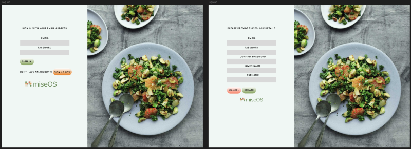
This image shows two auth screens side-by-side (login and registration) to validate the form layout, button hierarchy, and spacing.
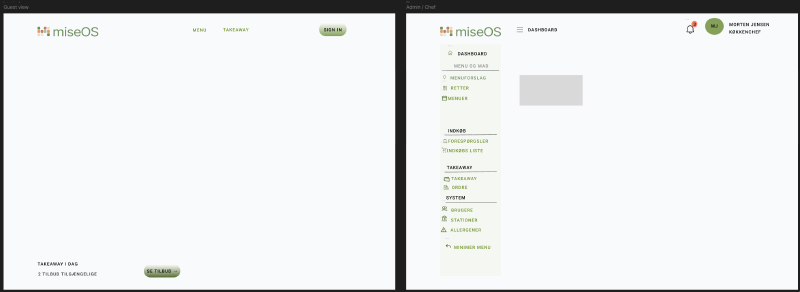
This image shows two main directions side-by-side: the public menu view and the management dashboard layout (sidebar + topbar + content area).
The goal wasn’t a finished design. It was to surface the questions I needed to answer before writing code:
- What is a layout?
- What is a page?
- What is a reusable component?
Understanding layouts#
At first, layouts felt like just another component. But after working through the problem, I realised they’re structural wrappers — they define the UI frame that pages live inside. They’re not about content, they’re about shape.
I landed on four:
| Layout | Used for |
|---|---|
PublicLayout | Header + Footer + content area — guests |
AuthLayout | Centered form — login, register |
AdminLayout | Sidebar + TopBar + scrollable content — HEAD_CHEF, SOUS_CHEF |
KitchenLayout | Simple header + content — LINE_COOK |
This updated my mental model from a flat list of pages to something layered:
App
 └── Layout
      └── Page
           └── Components
Mapping layouts to roles#
One of the most important decisions this week: layouts should map directly to user roles.
App
 ├── PublicLayout    → guests
 ├── AuthLayout      → login / register
 ├── AdminLayout     → HEAD_CHEF / SOUS_CHEF
 └── KitchenLayout   → LINE_COOK
After login, each role is routed to the right layout automatically. A line cook never sees the management dashboard. A guest never sees kitchen navigation. The roles I defined in the backend became the organizing principle of the entire UI — the same access control logic, expressed at a different layer.
That was actually a satisfying moment. The backend and frontend ended up speaking the same language because they were designed around the same domain model from the start.
Full component tree#
The hardest part was deciding what belongs in a layout, what belongs in a page, and what belongs in a reusable component. This is where I landed:
flowchart TD
App["App (Root)"]

App --> PublicLayout["PublicLayout (Guest)"]
App --> AuthLayout["AuthLayout (Auth Pages)"]
App --> AdminLayout["AdminLayout (Management)"]
App --> KitchenLayout["KitchenLayout (Kitchen Staff)"]

PublicLayout --> Header
PublicLayout --> Footer
PublicLayout --> PublicPages["Public Pages"]
PublicPages --> MenuPage
PublicPages --> TakeawayPage

AuthLayout --> LoginPage
AuthLayout --> RegisterPage

AdminLayout --> Sidebar
AdminLayout --> TopBar
AdminLayout --> AdminPages["Admin Pages"]
AdminPages --> DashboardPage
DashboardPage --> StatCards
DashboardPage --> WorkSection
DashboardPage --> PlanningSection
StatCards --> StatCard
WorkSection --> RequestsCard
WorkSection --> TakeawayCard
PlanningSection --> WeeklyMenuCard
PlanningSection --> SuggestionsCard

KitchenLayout --> KitchenHeader
KitchenLayout --> KitchenPages["Kitchen Pages"]
KitchenPages --> SuggestionsPage
KitchenPages --> RequestsPage
KitchenPages --> InspirationPage
Where data lives#
One thing Thinking in React made very clear: not every component should fetch its own data.
If StatCard fetched its own data, the dashboard would fire five separate API calls on load — one per card. And StatCard would be permanently coupled to a specific endpoint, making it useless anywhere else.
The pattern I settled on:
- Pages fetch data
- Components receive props
DashboardPage owns the fetch logic. StatCard just renders what it receives. This keeps components reusable and data flow predictable — the same separation of concerns I use between service layer and controller on the backend.
React concepts this week#
Working through the planning process made several React fundamentals click in a concrete way rather than staying abstract.
Components are the unit of composition. Every box in the diagram above becomes a function that returns JSX. The dashboard isn’t one big page — it’s a composition of StatCard, RequestsCard, and SuggestionsCard, each independently understandable and testable.
Props are how data flows down the tree. A StatCard that receives title, value, and subtext as props is useful everywhere. A StatCard that fetches its own data is useful in exactly one place.
State lives at the right level. The dashboard page owns the API state. Child components own only their local UI state — open/closed toggles, hover effects, form input. This is the core principle from Thinking in React: find the minimal state needed and place it at its natural home in the component tree.
JSX was immediately familiar — it looks like templating I’ve done in Thymeleaf, but with full JavaScript available inline. The key difference: JSX isn’t HTML. It compiles down to JavaScript function calls. The browser never sees JSX — it sees the React elements those calls produce.
Reflections#
What was difficult
Understanding what a layout really is took longer than I expected. It looks like a component, but it plays a different role — it’s a structural boundary, not a UI element. Getting that distinction clear before writing any code saved a lot of refactoring later.
Holding back from overengineering was also a challenge. When you’re planning a system it’s tempting to add global state, custom hooks, and complex abstractions before any real problem requires them. I deliberately kept the plan simple: layouts, pages, components, props down, events up.
What I learned
The most important lesson this week had nothing to do with React syntax. It was that the same structural thinking I apply to backend design transfers directly to the frontend. Separate concerns, define clear boundaries, let data flow in one direction.
React’s component model isn’t just a UI pattern — it’s a way of organizing a program. Once I saw it that way, the planning process felt familiar rather than new.
Next step#
The blueprint is ready. Next week: writing the actual code.
- Build
AdminLayoutwith Sidebar and TopBar - Build
DashboardPagewith static content - Build
AuthLayoutwith Login and Register pages - Set up React Router with role-based route protection (If i have time)
- Create the first reusable component —
StatCard
The goal is to move deliberately, understand each concept properly, and keep the implementation aligned with the structural decisions made this week.
This is part 11 of the MiseOS development log. Follow along as I build a management tool for professional kitchens, one commit at a time.