
Every feature built so far — dishes, allergens, stations, suggestions — existed to serve this one. The weekly menu is the reason MiseOS exists.
This week it finally came together.
What a menu actually is#
A weekly menu is not a flat list of dishes. It has slots — each one the intersection of a weekday and a station:
WeeklyMenu (week 22, 2026, DRAFT)
  └── MONDAY × VARMT    → Butter Chicken
  └── MONDAY × SALAT    → Caesar Salad
  └── TUESDAY × VARMT   → Stegt flæsk
  ...up to 25 slots (5 days × 5 stations)
From the frontend this breaks into two experiences. Admins get an editor — navigate by week, add dishes to slots, remove them, translate, publish. Kitchen staff and the public get a read-only display of the current published menu.
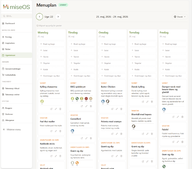
This is what the menu editor looks like in production:
The nested component hierarchy#
…
The admin editor was the first feature in the project with real component depth — not a list or a form, but an interactive grid where every cell is its own component with its own actions:
MenuEditorPage
  └── MenuEditorGrid
        └── MenuEditorDayColumn   (×5 days)
              └── MenuEditorSlotCard  (×5 stations per day)
Starting at the top and working down was the right approach. What data does the page need? A menu with its slots. What can happen? Slots can be added, edited, removed. The menu can be translated and published. The component tree followed naturally from those questions.
CSS grid — the key to five columns#
The grid is column-based: one column per weekday, slot cards stacked inside. At full width, five columns sit side by side. The layout is entirely responsive:
.menuGrid {
  display: grid;
  gap: var(--spacing-xs);
  grid-template-columns: 1fr;
}

@media (min-width: 768px)  { grid-template-columns: repeat(2, 1fr); }
@media (min-width: 1024px) { grid-template-columns: repeat(3, 1fr); }
@media (min-width: 1280px) { grid-template-columns: repeat(5, 1fr); }
On a canteen management screen at 1280px+, all five days are visible at once. On a tablet, two or three columns stack. The same component tree works across screen sizes — only the column count changes.
State ownership and callbacks#
The most important decision was where state lives. With four levels it’s tempting to let each level manage its own piece. The problem is they’re all the same thing: the current state of the menu.
All state lives in MenuEditorPage. Every component below receives data and fires callbacks upward. The delete flow across four levels illustrates how this works:
MenuEditorPage      handleRemoveSlot = async () => { ...API call, setMenu(...) }
  ↓ onRemove={handleConfirmRemove}
MenuEditorGrid
  ↓ onRemove={onRemove}
MenuEditorDayColumn
  ↓ onRemove={onRemove}
MenuEditorSlotCard  → calls onRemove(menuSlot.menuSlotId)
MenuEditorSlotCard never calls the API. It fires onRemove(menuSlot.menuSlotId) and the signal travels back up to MenuEditorPage, which sets a confirm dialog, then calls the service and updates state on confirm.
In MenuEditorDayColumn, each card gets its own handler bound to its slot via a closure:
{menuSlots?.map((menuSlot) => (
  <MenuEditorSlotCard
    key={menuSlot.menuSlotId}
    menuSlot={menuSlot}
    onRemove={onRemove}
    onEdit={onEdit}
    ...
  />
))}
() => onRemove(menuSlot.menuSlotId) captures the correct ID at the point of creation. Each card in the loop gets its own version — this is a closure. When the card fires the callback, the correct slot ID is already baked in.
One interesting detail: stations is not passed as a prop through the tree. MenuEditorDayColumn reaches directly into the layout context:
const { stations } = useOutletContext();A component three levels deep fetching from AdminLayout’s context directly — rather than drilling the prop through MenuEditorPage and MenuEditorGrid. It works cleanly here because stations are stable shared data, not something MenuEditorPage owns.
The dish selector modal#
Adding a dish to a slot opens a modal. modalConfig tracks which slot is being filled:
const [modalConfig, setModalConfig] = useState(null);
// { day: 'MONDAY', station: { id, name }, slotId: null | id }
null means closed. A non-null config means a specific slot is active. The same state handles both adding a new dish and replacing an existing one — if slotId is set, it’s an update; if not, it’s a new slot.
Inside the modal, available dishes are split into two categories per station:
const thisWeekDishes = availableDishes?.thisWeekDishes?.[stationName] || [];
const fromBankDishes = availableDishes?.fromDishBank?.[stationName] || [];
“This week’s dishes” are suggestions approved for that week. “From the dish bank” are all approved dishes ever created. The split gives admins a fast path to what’s already planned, with the full bank as a fallback.
The translation flow#
Every dish slot needs an English translation before the menu can be published. MiseOS uses DeepL via the backend — either per slot or all at once.
The publish button is disabled until all conditions are met:
const untranslatedSlots = menu?.menuSlots?.filter(
  (s) => s.menuDish && !s.menuDish.hasTranslation
) ?? [];
const hasUntranslated = untranslatedSlots.length > 0;
const menuIsEmpty = !menu?.menuSlots?.some((s) => s.menuDish);

<Button
  name={isPublishing ? 'Udgiver...' : 'Udgiv menu'}
  disabled={isPublishing || menuIsEmpty || hasUntranslated}
  title={
    menuIsEmpty     ? 'Tilføj retter til menuen inden udgivelse' :
    hasUntranslated ? 'Oversæt alle retter til engelsk inden udgivelse' :
    undefined
  }
/>
hasUntranslated and menuIsEmpty are derived state — calculated from the menu on every render, not stored separately. The warning badge counts exactly how many slots are missing a translation. The “Oversæt alle” button calls menuService.translateAll() and the returned updated menu replaces state in one step.
One CSS detail that mattered: pointer-events: none on :disabled prevented the native title tooltip from appearing on the disabled publish button. The fix was removing it and using :hover:not(:disabled) for hover styles instead.
A component that emerged from two contexts#
Halfway through building the slot cards, allergen display was needed in two forms: compact (icon only, small grid) in the editor, and full (icon + name as a pill) in the public menu. Two components were started, then merged into one AllergenList with a variant prop:
<AllergenList allergens={dish.allergens} variant="compact" />
<AllergenList allergens={dish.allergens} variant="full" language={language} />
Any future change to allergen display happens once. Both contexts update.
Prop drilling — knowing the name for the trade-off#
With four levels of nesting, callbacks from MenuEditorPage pass through MenuEditorGrid and MenuEditorDayColumn on their way to MenuEditorSlotCard. The middle components carry props they have no use for — they just forward them.
This is called prop drilling. For a tree this size it’s manageable. For anything deeper, a React context or a dedicated state solution reduces the noise. It’s worth knowing the name for the trade-off rather than just feeling vaguely uncomfortable about the extra props.
Reflections#
The menu required more upfront planning than any previous feature. Deciding the component tree and where state would live before writing any JSX meant fewer rewrites. The pattern held: MenuEditorPage owns everything, nothing below it fetches its own data (except the stations from layout context — a pragmatic exception that avoided unnecessary prop drilling).
The translation requirement being enforced at the UI level — not just validated on submit — made a real difference to how the editor feels. The warning count, the per-slot translate icon, and the disabled publish button all tell the same story without a single error message.
The canteen menu is live. Everything else in the app was preparation for this screen.
This is part 16 of the MiseOS development log. Follow along as I build a management tool for professional kitchens, one commit at a time.